How To Make Videos Responsive with CSS

How To Make Videos Responsive with CSS

A responsive website means It will respond to your browser sizes or I can browser stretches. The basic idea of it is to give optimal viewing experience to visitors, nowadays you will rarely see a unresponsive website. If you remember a Jquery snippet I posted about detecting browser real time size It is also responsive. So basically in order to make websites responsive on load you need a meta tag that helps you to stretch/resize the elements of your website but It's not required for this tutorial.

So for this tutorial, only videos with iframe, embed or objects works. You can get the iframe code of any videos from popular websites like YouTube, DailyMotion, Vimeo, MetaCafe etc.

Let's make our style, here's the css we need(if you are a beginner make sure you put the codes within <style>) :

 .Responsive-Video {
    position: relative;
    padding-bottom: 56.25%;
    padding-top: 30px;
    height: 0;
    overflow:
    hidden;
}
   
.Responsive-Video iframe, .Responsive-Video object, .Responsive-Video embed {
    position: absolute;
    top: 0;
    left: 0;
    width: 100%;
    height: 100%;
}


So after adding the css to your web page, add your video embed code within the div class given below(I know this is NOOB! )  :

<div class="Responsive-Video">

    </div>


Example :

<div class="Responsive-Video">
    <iframe width="760" height="720" src="http://www.youtube.com/embed/Mu4ARzSZOmg" frameborder="0" allowfullscreen></iframe>
    </div>


Screenshot : 

YouTube Responsive Video

If you're using Blogger or Wordpress you can just add the css code within the body and whenever you post a video in your post you can add the embed code within the div class.

The Evolution of Music and Video Content Consumption

The Evolution of Music and Video Content Consumption

Question: How many ways are there to consume music today?
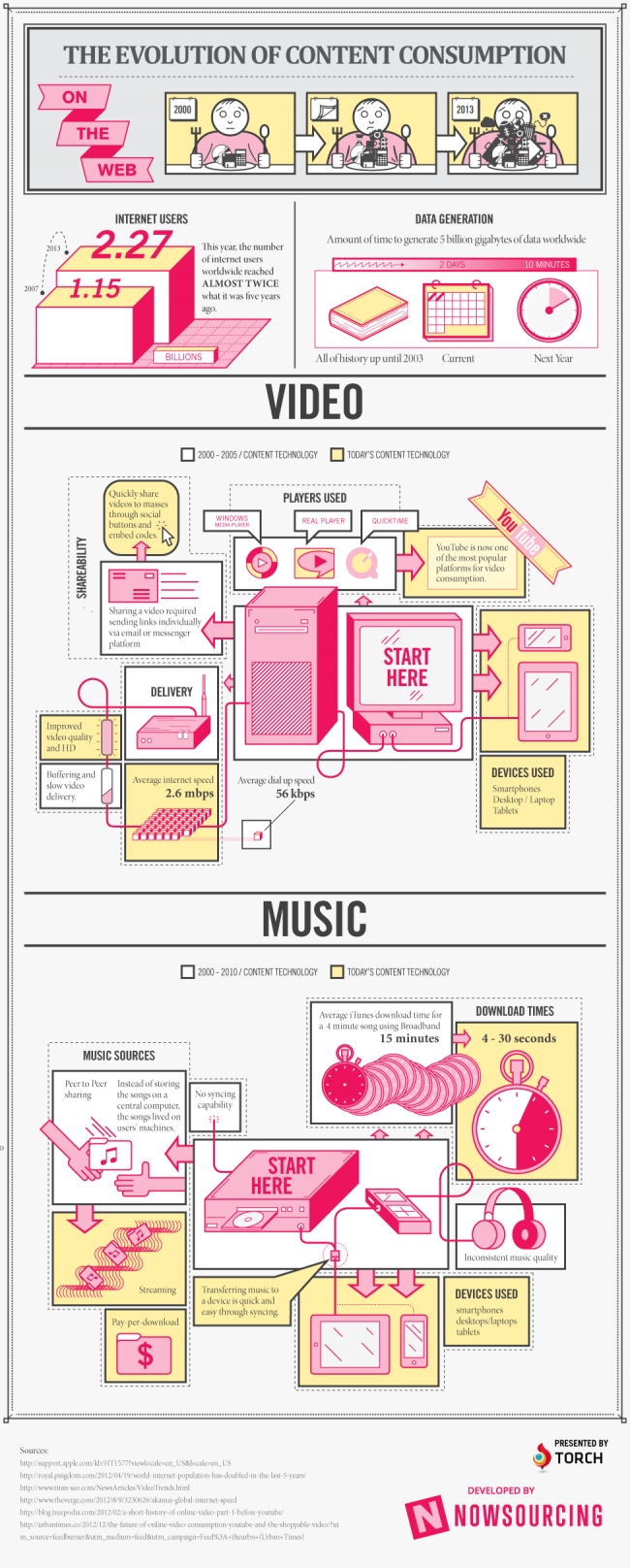
Answer: More than you can guess. The way we consume content, including music, has undergone a few changes in the past decade or so. As recently as the years between 2000 and 2005, we connected to the Internet at a speed of about 56 kbps. Today, Internet connection speeds average about 2.6 mbps. What seemed like the greatest thing since sliced bread in 2000 would seem so frustratingly slow that today’s users would be utterly appalled by the length of time it took to load a single web page. Thanks to the speed at which we can connect to the world at large, we’re consuming a great deal of content in new ways.

Desktop PCs, while still used in business and office settings, as well as many homes, are often a last resort to mobile users. We prefer to connect on the go, without being chained to a desk, using devices such as smartphones and tablets. We’re consuming the majority of our content today digitally. Whether it’s music, video, news or even books—we turn to the World Wide Web first. Take a look at the infographic below for more details on how content consumption has evolved over the past 10 to 15 years.

TorchBrowser is a free and unique software that offers you powerful browsing together with built-in media downloading and sharing features.